Color plays a crucial role in the exterior design of single wide homes, influencing both aesthetics and psychology. The choice of hues for a home’s exterior can evoke specific emotions, set moods, and shape perceptions of the space. Thoughtful color selection can transform a single wide exterior, creating a welcoming atmosphere and enhancing its visual appeal.
Different colors elicit varied responses from viewers. Warm tones like red and yellow can convey energy and optimism, making a home appear more inviting. Cool shades such as blue and green often evoke feelings of tranquility and connection to nature. Neutral colors like beige or gray provide versatility and can complement various architectural styles.
When selecting colors for single wide exteriors, it’s important to consider the surrounding environment, climate, and desired emotional impact. The right palette can make a home feel larger, more harmonious with its surroundings, or stand out as a unique statement piece. By understanding color psychology, homeowners can make informed decisions that enhance their single wide’s curb appeal and create a positive first impression.
Fundamentals of Color Psychology

Color psychology explores how different hues influence human perception, emotions, and behavior. This field combines insights from visual processing, cultural associations, and physiological responses to color stimuli.
Understanding Color Perception
Color perception begins in the eye, where specialized cells called cones detect different wavelengths of light. The brain then interprets these signals, creating the experience of color. Individual differences in cone sensitivity can lead to variations in color perception.
Cultural and personal experiences also shape how colors are interpreted. For example, red may evoke feelings of excitement or danger in Western cultures, while it symbolizes good fortune in some Eastern traditions.
Environmental factors like lighting conditions and surrounding colors can alter how a particular hue is perceived. This phenomenon, known as color context, plays a crucial role in architectural and design applications.
Historical Use of Color in Architecture
Ancient civilizations incorporated color symbolism into their architectural practices. Egyptian temples used bold pigments to represent divine qualities, while Greek structures were painted in vibrant hues, contrary to the common misconception of stark white buildings.
During the Renaissance, color choices became more refined, with architects using subtle tones to enhance spatial perception. The Industrial Revolution brought new pigments and materials, expanding the color palette available to designers.
Modernist architects often favored neutral tones, emphasizing form over color. However, postmodern and contemporary architects have embraced vibrant colors as expressive elements in their designs.
Color Psychology Principles
Color temperature influences spatial perception. Warm colors (reds, oranges, yellows) tend to advance visually, making spaces feel more intimate. Cool colors (blues, greens, purples) recede, creating a sense of openness.
Saturation levels affect emotional responses. Highly saturated colors evoke energy and excitement, while muted tones promote calmness and relaxation.
Color harmony principles guide effective combinations:
- Complementary colors create vibrant contrasts
- Analogous colors produce harmonious schemes
- Triadic color schemes offer balanced, dynamic compositions
Contrast between light and dark colors can define architectural features and create visual interest. High contrast schemes increase readability and accessibility in design.
Influence of Color in Single Wide Exteriors
Color choices for single wide exteriors significantly impact both the visual appeal and emotional response to these homes. Architects utilize color strategically to enhance architectural features and create desired atmospheres.
Emotional Impact of Exterior Colors
Red exteriors convey energy and excitement, potentially increasing curb appeal for single wide homes. Blue tones evoke feelings of calm and tranquility, making them suitable for creating a peaceful residential environment.
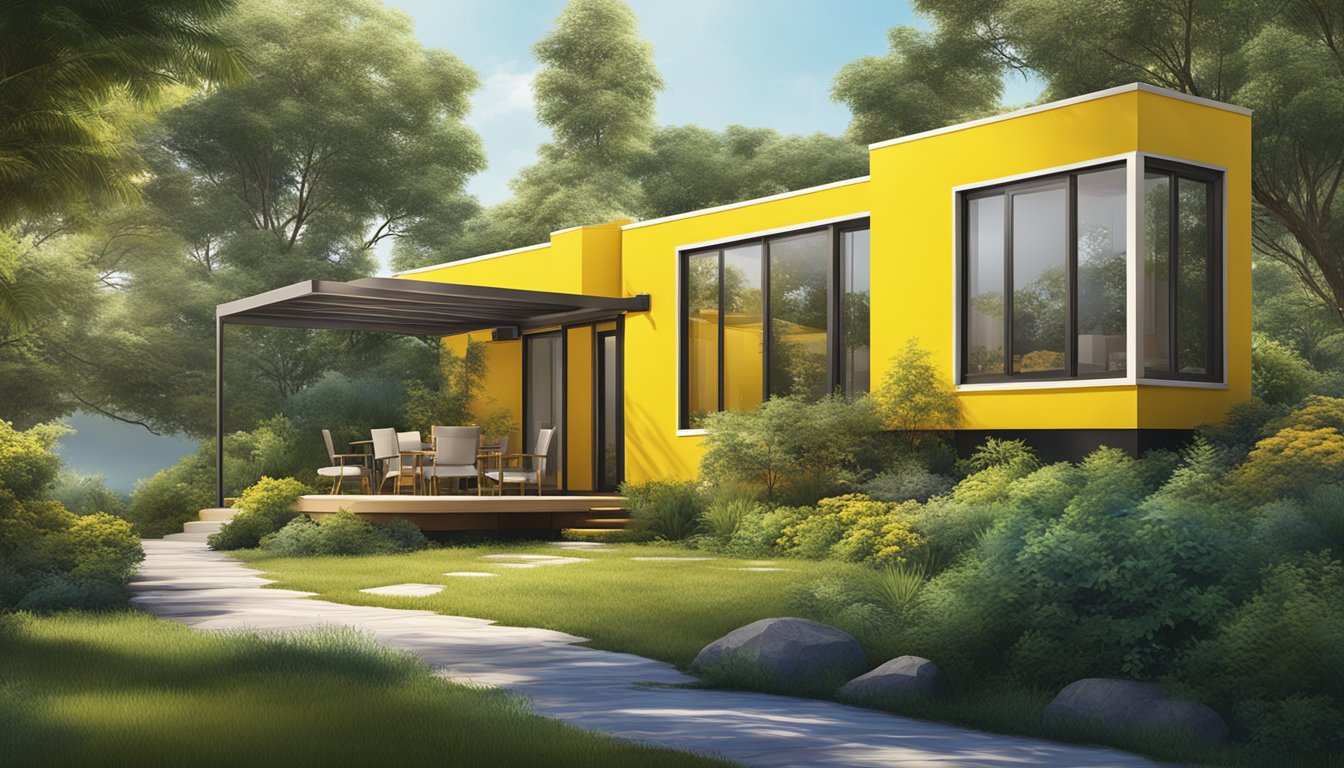
Yellow hues promote cheerfulness and optimism, brightening the appearance of single wide exteriors. Green shades connect the structure with nature, fostering a sense of harmony and balance.
Neutral colors like beige or gray offer versatility and timeless appeal. These subdued tones can make single wide homes appear larger and more sophisticated.
Visual Effects of Color in Architecture
Light colors reflect sunlight, making single wide exteriors appear more spacious and airy. This effect can be particularly beneficial for smaller manufactured homes.
Dark hues absorb light, creating a sense of depth and solidity. They can help single wide structures appear more grounded and substantial.
Contrasting color schemes highlight architectural details, drawing attention to unique features of single wide homes. This technique can enhance visual interest and perceived value.
Monochromatic color palettes create a cohesive look, unifying the exterior elements of single wide homes. This approach can result in a sleek, modern aesthetic.
Color gradients or ombré effects add visual dynamism to single wide exteriors, creating the illusion of movement and depth.
Color Selection Process
Choosing colors for a single wide exterior involves careful consideration of various factors. The process requires balancing aesthetic appeal with practical concerns to create a cohesive and attractive design.
Criteria for Choosing Color Palettes
Color palettes for single wide exteriors should complement the home’s architecture and surroundings. Consider the building’s style, size, and existing features when selecting hues. Neutral tones like beige, gray, or white often serve as versatile base colors.
Accent colors can add visual interest and highlight architectural details. Use bolder shades sparingly on trim, doors, or shutters. Aim for a harmonious combination of 2-3 colors that work well together.
Climate plays a role in color choice. Lighter colors reflect heat in warm regions, while darker hues absorb warmth in cooler areas. Consider how colors will age and maintain their appearance over time.
The Role of Light and Environment
Natural light greatly influences color perception on exterior surfaces. Colors appear differently at various times of day and in changing weather conditions. Test paint samples on the actual exterior to see how they look in different lighting.
Surrounding landscape and neighboring buildings impact color choices. Select shades that blend with or complement the natural environment. Consider the colors of nearby homes to ensure your palette fits within the neighborhood aesthetic.
Seasonal changes affect how colors appear. Choose hues that look appealing year-round, accounting for changes in foliage and light. Colors may appear more vibrant in bright sunlight and muted on overcast days.
Color Trends in Residential Exteriors

Exterior color choices for single wide homes are evolving, with new trends emerging for 2024. Homeowners are exploring diverse palettes to express their style while considering community aesthetics.
Popular Color Schemes for Single Wides
Navy blue exteriors are gaining popularity, offering a bold yet sophisticated look. This deep hue can make a striking statement and pairs well with light-colored trim.
Earthy greens are also on the rise, reflecting a connection to nature. These shades range from sage to forest green, creating a calming and inviting facade.
Warm whites and creamy tones are replacing stark whites, providing a softer appearance. These neutral colors offer versatility and timeless appeal.
Gray continues to be a favorite, with variations from light pearl to charcoal. It serves as an excellent base for accent colors or architectural features.
Adapting to Personal Taste and Community Standards
While trends provide inspiration, personal preferences play a crucial role in color selection. Homeowners should consider their lifestyle and the home’s surroundings when choosing exterior colors.
Many communities have guidelines on acceptable exterior colors. It’s important to check local regulations before making drastic changes.
Accent colors can add personality without overwhelming the neighborhood aesthetic. Doors, shutters, and trim offer opportunities for pops of color.
Testing paint samples in different lighting conditions is essential. Colors can appear differently throughout the day and seasons.
Challenges in Implementing Color Schemes
Applying effective color schemes to single wide exteriors presents unique obstacles. Homeowners and designers must navigate practical constraints while striving for aesthetic appeal.
Overcoming Common Pitfalls
Limited surface area can make bold colors overwhelming. Darker shades may visually shrink the structure, while overly bright hues draw unwanted attention. Balancing complementary colors becomes crucial to avoid a chaotic appearance.
Coordinating with existing elements like roofing and trim requires careful consideration. Mismatched colors can create visual discord. Weather exposure often leads to fading, necessitating frequent touch-ups or repainting.
Neighborhood guidelines and HOA restrictions may limit color choices. This can stifle creativity and personal expression. Budget constraints sometimes force compromises on paint quality or professional application.
Dealing with Climate and Material Limitations
Extreme temperatures affect paint adhesion and longevity. Hot climates demand heat-reflective colors to improve energy efficiency. Cold regions require paints resistant to freeze-thaw cycles.
High humidity areas face increased risks of mold and mildew growth on exterior surfaces. UV radiation in sunny locales causes faster color fading. Coastal salt air corrodes certain paint types.
Material compatibility issues arise with different siding options. Vinyl siding warps under dark colors that absorb heat. Metal surfaces need special primers to prevent rust. Wood requires regular sealing and maintenance.
Paint formulations must balance durability with environmental concerns. VOC regulations limit options in some areas. Eco-friendly paints may offer reduced performance or higher costs.
Case Studies and Examples

Color choices can dramatically transform single wide exteriors. Several notable projects showcase innovative uses of color to enhance curb appeal and evoke specific emotions.
Successful Single Wide Exterior Projects
The “Sage Oasis” project in Arizona utilized a soft green palette to blend the home with its desert surroundings. Architects chose sage green siding paired with warm beige trim, creating a soothing and inviting exterior. This color scheme helped the home appear larger and more grounded in its environment.
In Maine, the “Coastal Charm” renovation breathed new life into a dated single wide. Navy blue siding with crisp white accents evoked a classic New England aesthetic. The bold color choice made the home stand out while still complementing neighboring structures.
Color Transformations and Their Impact
A faded beige single wide in Texas underwent a remarkable transformation. Designers selected a warm terracotta hue for the siding, accented by rich brown trim. This earthy color palette elevated the home’s appearance and increased its perceived value.
In a suburban neighborhood, a plain white single wide became a cheerful focal point. Pale yellow siding paired with white trim created a sunny, welcoming exterior. Neighbors reported the vibrant color choice lifted the mood of the entire street.
Religious buildings have also embraced color in mobile structures. A traveling chapel used deep purple siding to convey spirituality and dignity. The rich hue drew attention and created a sense of reverence for the mobile worship space.
Conclusion

Color choices for single wide exteriors profoundly impact both aesthetics and psychology. The right palette can transform a modest structure into an inviting home. Warm hues like reds and oranges evoke energy and excitement, while cool blues and greens promote calmness and serenity.
Neutral tones offer versatility and timeless appeal. They allow homeowners to easily update accents and landscaping without clashing. Earth tones connect the home to its natural surroundings, creating a sense of harmony and belonging.
Thoughtful color selection can visually expand the perceived size of a single wide. Light colors reflect more light, making the structure appear larger. Strategic use of darker accents adds depth and visual interest.
Color psychology principles apply equally to manufactured homes as to traditional architecture. The exterior palette sets expectations for the interior and influences how occupants and visitors feel about the space.
Ultimately, the most successful color schemes for single wide exteriors balance personal taste with psychological impact. They consider the home’s setting, architectural style, and intended emotional effect to create a cohesive and appealing result.