Color plays a crucial role in transforming single wide interiors. The right color choices can make spaces feel larger, more inviting, and perfectly tailored to the occupant’s lifestyle. Lighter and cooler hues tend to create an illusion of spaciousness, while darker shades can make areas feel more intimate and cozy.
In single wide homes, where every square foot counts, strategic use of color becomes even more important. Blues and greens can evoke a sense of tranquility, perfect for bedrooms or relaxation areas. Warm tones like yellows and oranges can energize living spaces and kitchens, promoting activity and social interaction.
Careful consideration of color psychology can significantly impact the overall ambiance of a single wide interior. By selecting colors that align with the desired mood and function of each space, residents can create a harmonious and personalized environment that maximizes the potential of their compact living areas.
Understanding Color Theory

Color theory provides the foundation for creating harmonious and visually appealing interiors in single wide homes. It explains how colors interact and how they can be combined effectively to achieve desired aesthetic and emotional effects.
The Basics of Color Theory
Color theory is rooted in the principles of light and perception. It explores how different hues relate to each other and influence human emotions and behavior. The three main properties of color are hue (the actual color), value (lightness or darkness), and saturation (intensity).
These properties play a crucial role in creating balanced and cohesive color schemes. By manipulating these aspects, designers can create various moods and atmospheres within a space. Understanding these basics allows for more informed color choices in single wide interiors.
Color Wheel and Color Relationships
The color wheel is a visual representation of color relationships. It organizes hues in a circular format, making it easier to identify harmonious color combinations. The wheel typically includes 12 colors: three primary, three secondary, and six tertiary.
Key color relationships include:
- Complementary: Colors opposite each other on the wheel
- Analogous: Colors adjacent to each other
- Triadic: Three colors evenly spaced around the wheel
These relationships guide designers in creating balanced and visually interesting color schemes for single wide interiors.
Primary, Secondary, and Tertiary Colors
Primary colors (red, blue, and yellow) form the basis of all other colors. They cannot be created by mixing other hues. Secondary colors (green, orange, and purple) are made by combining two primary colors in equal amounts.
Tertiary colors result from mixing a primary and an adjacent secondary color. Examples include yellow-green, blue-green, and red-orange. This expanded palette offers more nuanced options for interior design.
Understanding these color categories helps in creating diverse and sophisticated color schemes in single wide homes. It allows for better control over the visual impact and emotional resonance of a space.
Psychology of Color in Interior Design

Color choices in interior design significantly impact emotions, mood, and behavior. Understanding color psychology allows designers to create spaces that evoke specific feelings and atmospheres.
Emotional Influence of Colors
Different colors trigger distinct emotional responses. Red stimulates energy and excitement, while blue promotes calmness and relaxation. Yellow can inspire cheerfulness and optimism, whereas green often creates a sense of balance and harmony.
Color intensity also plays a role. Bright, saturated hues tend to energize, while muted tones have a more soothing effect.
In single wide interiors, strategic color use can influence perceived space. Light colors make rooms feel larger and more open, while darker shades create coziness and intimacy.
Color Psychology and Mood
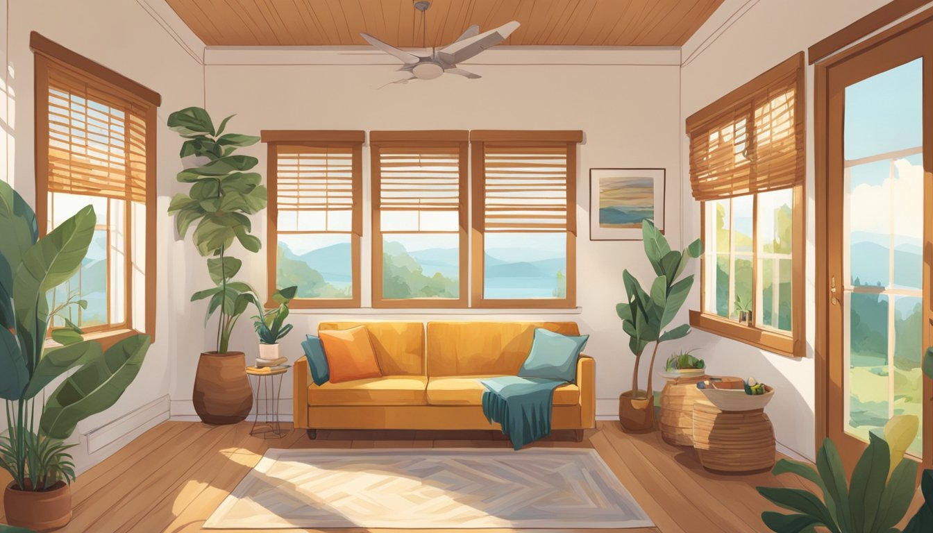
Colors shape the mood of a space. Warm colors like oranges and reds can create a welcoming, social atmosphere ideal for living areas. Cool colors such as blues and greens work well in bedrooms, promoting tranquility and restfulness.
Purple adds a touch of luxury and creativity, making it suitable for home offices or artistic spaces. Neutral tones like beige and gray offer versatility and can be paired with bolder accent colors.
Designers consider the intended function of each room when selecting color schemes. A kitchen might benefit from appetite-stimulating yellows, while a bathroom could incorporate refreshing aqua tones.
Psychological Effects of Color Choices
Color choices can influence behavior and cognitive function. Studies show that blue can enhance productivity and focus, making it a good choice for work areas. Green has been linked to improved reading ability and creativity.
Some colors may even affect physical perceptions. Rooms painted in cool colors often feel cooler in temperature, while warm-hued spaces can feel warmer.
The psychological impact of color extends to pattern and texture as well. Combining colors in various ways can create visual interest and depth, affecting the overall mood of a space.
Designers must also consider cultural associations with colors, as these can vary widely and influence how occupants perceive and interact with their environment.
The Impact of Light and Saturation

Light and saturation play crucial roles in shaping the perception of color within single wide interiors. These factors can dramatically alter the mood and feel of a space, making rooms appear larger, cozier, or more vibrant.
Influence of Lighting on Colors
Natural and artificial lighting significantly affect how colors are perceived in single wide interiors. Sunlight changes throughout the day, altering the appearance of wall colors. Morning light tends to cast a warm, golden hue, while midday sun provides the truest color representation. Evening light often creates a cooler, bluer tone.
Artificial lighting also impacts color perception. Incandescent bulbs emit a warm light that enhances reds and yellows. Fluorescent lights can make colors appear cooler and sometimes harsh. LED lights offer a range of color temperatures, allowing for customization of the lighting ambiance.
To maximize space in single wide interiors, strategically placed lighting can highlight certain areas and create depth. Task lighting in kitchens and reading nooks can make these spaces feel more defined and functional.
Understanding Tints, Shades, and Saturation
Tints, shades, and saturation levels can dramatically impact the feel of single wide interiors. Tints are created by adding white to a pure color, resulting in lighter variations. These can make spaces feel more open and airy, ideal for smaller rooms.
Shades are produced by adding black to a pure color, creating darker variations. These can add depth and coziness to larger areas within a single wide home. Saturated colors are intense and vivid, while desaturated colors appear more muted and subdued.
In single wide interiors, using a mix of tints, shades, and saturation levels can create visual interest and depth. Light, desaturated colors on walls can make rooms feel spacious, while pops of saturated color in accessories can add energy and personality to the space.
Designing Single Wide Interiors

Color plays a crucial role in transforming single wide interiors. Strategic use of color can enhance space perception, improve functionality, and create stylish living areas.
Maximizing Space with Color
Light colors can make single wide interiors feel more spacious. Painting walls in soft whites, pale grays, or light beiges creates an airy atmosphere. These hues reflect light, making rooms appear larger and brighter.
Vertical stripes on walls can add height to low ceilings. Horizontal stripes, when used sparingly, can widen narrow spaces. Monochromatic color schemes also contribute to a sense of openness.
Using the same light color on walls and ceilings eliminates visual breaks, creating a seamless look that expands the perceived space. This technique works particularly well in compact living areas and bedrooms.
Choosing a Color Palette for Functionality and Style
A well-chosen color palette enhances both functionality and style in single wide interiors. Cool colors like blues and greens promote relaxation, making them ideal for bedrooms and bathrooms.
Warm tones such as yellows and oranges energize spaces, suiting kitchens and dining areas. Neutral colors provide versatility and can be easily accessorized to change the room’s mood.
Consider the natural light in each room when selecting colors. Rooms with ample sunlight can handle darker shades, while dimly lit spaces benefit from lighter hues.
Create visual interest by using a 60-30-10 color rule: 60% dominant color, 30% secondary color, and 10% accent color. This balance ensures a cohesive look throughout the interior.
Creative Use of Neutrals and Pops of Color
Neutrals form an excellent base for single wide interiors. They create a calm backdrop and allow for flexibility in decor changes. Shades of white, beige, and gray work well as primary colors.
Add depth to neutral spaces with textured elements like woven baskets, chunky knit throws, or patterned rugs. These details prevent the interior from feeling flat or boring.
Introduce pops of color through accessories, artwork, or furniture pieces. Bold throw pillows, vibrant curtains, or a colorful accent chair can instantly liven up a neutral room.
Use color blocking techniques to define different areas within open-concept layouts. This method helps separate spaces visually without the need for physical dividers, maintaining an open feel.
Color Schemes and Interiors

Color schemes play a vital role in shaping the atmosphere of single wide interiors. The right combinations can transform small spaces, creating visual interest and evoking specific moods.
Harmonizing with Analogous Color Schemes
Analogous color schemes use hues that sit next to each other on the color wheel. This approach creates a cohesive and harmonious look in single wide interiors. For example, combining shades of blue, green, and teal can evoke a serene coastal vibe.
In living areas, walls painted in a soft blue-green with furniture in deeper blue tones create depth. Accessories in lighter greens add layers of interest without overwhelming the space.
For bedrooms, a palette of lavender, purple, and blue promotes relaxation. Lighter shades on walls open up the room, while deeper tones in bedding and curtains add coziness.
Contrast and Balance with Complementary Colors
Complementary colors sit opposite each other on the color wheel, creating striking contrasts. This scheme adds energy and visual interest to single wide interiors when used judiciously.
A living room with warm orange walls paired with blue accent pieces creates a lively atmosphere. The key is balance – use the bolder color sparingly to avoid overpowering the space.
In kitchens, yellow walls with purple accessories can be unexpected yet appealing. Neutral cabinets and countertops help ground the look and prevent it from becoming too intense.
The Serenity of Monochromatic Themes
Monochromatic color schemes use variations of a single hue. This approach creates a calm, unified look that’s particularly effective in smaller spaces like single wide interiors.
A bedroom in shades of green, from pale sage walls to emerald accents, feels fresh and tranquil. Varying textures prevent the look from becoming flat.
In bathrooms, a monochromatic blue scheme can evoke a spa-like atmosphere. Light blue walls, navy towels, and a blue-grey vanity create depth without clutter.
Vibrancy of Triadic Color Schemes
Triadic color schemes use three evenly spaced colors on the color wheel. This approach adds vibrancy to single wide interiors while maintaining visual balance.
A living area with yellow walls, red furniture, and blue accessories creates an energetic yet harmonious space. Using muted versions of these colors prevents the scheme from becoming overwhelming.
In children’s rooms, a triadic scheme of purple, green, and orange can be playful and stimulating. White or neutral elements help balance the bold colors and prevent visual overload.
Incorporating Personal Style

Color choices in single wide interiors offer a unique opportunity to express individuality and enhance well-being. The right palette can transform a compact space into a personalized haven that reflects the occupant’s tastes and lifestyle.
Reflecting Individuality in Color Choices
Personal style shines through carefully selected hues. Bold individuals might opt for vibrant accent walls in their favorite shades, while those seeking tranquility can choose soft, muted tones. Mixing complementary colors creates visual interest and depth.
Incorporating meaningful colors, such as those reminiscent of cherished memories or places, adds a personal touch. Texture and pattern in color applications, like wallpapers or textiles, further express individual flair.
Consider using color to define different areas within the single wide space. This technique can create distinct zones for various activities while maintaining a cohesive overall look.
The Role of Personal Preferences and Well-Being
Color choices significantly impact mood and comfort in compact living spaces. Warm hues like reds and oranges can energize social areas, while cool blues and greens promote relaxation in bedrooms.
Personal color preferences often stem from positive associations. Incorporating these favored shades can boost happiness and create a sense of belonging in the home.
It’s essential to balance personal taste with color psychology principles. For example, someone who loves bold colors might use them as accents rather than dominant shades to avoid overstimulation in a small space.
Lighting plays a crucial role in how colors are perceived. Natural and artificial light sources should be considered when selecting paint colors to ensure they enhance well-being throughout the day.
Current Trends and Innovations

Color trends in single wide interiors are evolving to create more impactful and harmonious living spaces. Designers are embracing nature-inspired palettes and sustainable choices to transform these compact homes.
Exploring Contemporary Color Trends
Curved furniture pieces are gaining popularity in single wide interiors. This trend adds visual interest and softens the angular nature of many manufactured homes. Designers are moving away from stark white walls, instead opting for color drenching techniques. This approach involves using a single hue across walls, trim, and ceilings to create a cohesive look.
Pale blues and soft beiges are becoming increasingly requested by homeowners. These colors create a soothing atmosphere in limited spaces. Clay-like shades and plaster pinks offer warmth while maintaining a neutral base.
Designers recommend testing colors extensively before committing to ensure the best fit for each unique space.
Sustainable and Earthy Tones
Earthy tones are dominating color palettes in single wide interiors. Muddy hues and muted shades bring a sense of groundedness to these homes. Soft brown-toned grays offer versatility and create a calming backdrop for various decor styles.
Terra cotta and rust colors are emerging as popular accent choices. These warm tones add depth and character to smaller spaces. Natural materials like wood and stone are being incorporated to complement these earthy color schemes.
Sustainable paint options with low VOCs are becoming more prevalent. These eco-friendly choices align with the growing focus on environmental consciousness in interior design.
Integrating Greenery and Calming Blues
Bringing the outdoors inside is a key trend in single wide interiors. Shades of green are being used to create a connection with nature. Sage and olive tones offer a fresh, organic feel without overwhelming compact spaces.
Calming blues are being paired with greens to evoke a serene atmosphere. Light, airy blues reminiscent of clear skies help to visually expand tight quarters. Deeper ocean-inspired blues can be used as accents to add depth.
Plants are being integrated as living color elements. Potted herbs in kitchens and hanging plants in living areas introduce vibrant greens while improving air quality. This trend combines aesthetics with functionality in single wide homes.
Creating Atmosphere and Ambiance

Color selection profoundly impacts the atmosphere and ambiance of single wide interiors. The right color choices can transform small spaces, evoking specific moods and enhancing the overall feel of each room.
Establishing Atmosphere with Warm and Cool Colors
Warm colors like reds, oranges, and yellows create a cozy, inviting atmosphere in single wide interiors. These hues can make spaces feel more intimate and energetic. In living areas or kitchens, warm tones promote socializing and stimulate appetite.
Cool colors such as blues, greens, and purples generate a sense of calm and spaciousness. These shades work well in bedrooms or bathrooms, fostering relaxation and tranquility. Cool tones can make compact areas feel larger and more open.
Neutral colors like beiges, grays, and whites offer versatility in single wide homes. They provide a blank canvas for decorating and can be easily paired with both warm and cool accents.
Cultivating Tranquility in Living Spaces
Soft, muted colors promote a sense of peace in single wide interiors. Pale blues and greens mimic nature, creating a serene environment. Light lavenders and gentle grays also contribute to a tranquil atmosphere.
Monochromatic color schemes using varying shades of a single hue can create a harmonious, calming effect. This approach works particularly well in bedrooms or reading nooks.
Natural materials and textures complement calming colors. Incorporating wood tones, woven textiles, and plants enhances the tranquil ambiance in small living spaces.
Accentuating With Accent Colors
Accent colors add visual interest and depth to single wide interiors. Bold hues used sparingly can create focal points and break up monotony in neutral spaces.
In living areas, vibrant throw pillows or artwork can inject energy without overwhelming the space. A bright accent wall in a bedroom can add personality while maintaining a restful atmosphere.
Metallic accents like gold, silver, or copper introduce glamour and reflect light, making spaces feel larger. These can be incorporated through light fixtures, picture frames, or decorative objects.